Forum Update And New Theme

I like the new mobile version much better, at least in terms of speed. It loads a LOT quicker than before. The mobile layout is nice too but I didn't have any complaints about the previous mobile layout.

For me, the browser version of the forums is going to take a little getting used to. Nothing really wrong with it....its just new and different. Got too used to the previous layout.
 
Yeah I finally got around to tweaking the colors, I missed the "AD Styler" thing where you can do that. I still think the main colors in the dark theme need to be darker or give us the option to adjust those too, but otherwise it's a fresh change.
 
I've heard the saying that if you put a donkey in-between two bales of hay it would starve to death trying to decide which one to go to... Most horses I've been around would just go eat one bale of hay, then go eat the other. ;)
 
  • Like
Reactions: Kilgore Trout
On my wndows 8 phone with uc browser new site sux just as much as old. Several technical issues flashes white, slow loading numerous ads, difficult navigation, general issues...

On server 2012 r2 with IE 11 it looks pretty good, but is a little slow to load no technical issues.

On server 2012 r2 with FF 28 it is pretty nice no technical issues.

On my nook color it looks pretty good a little slow to load probably due to ads.

I am not using any ad blockers or fancy viewers like tapatalk. Biggest problems are on windows phone, once market share increases issues will decrease with windows mobile in general.
 
Last edited:
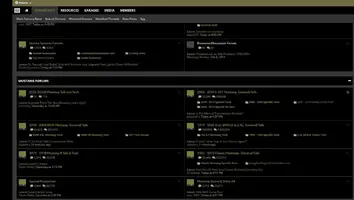
@LaserSVT and anyone else who uses the dark theme:

Take a look. The only thing that is changes here is that the background has been darkened. All other aspects are user changeable. Do you guys like this scheme better, not as much, or are you indifferent to the change? Let me know.

Dark sample 2014.webp
 
The notification icon (dunno about lighter schemes) in the dark schemes is annoying. Get the red flag to show someone has responded or quoted you, you go to hover the curser over it and as it shifts to show you the notification it also shifts to the right which moves your curser off the notification and over to messages.
Minor but annoying.